
Plandek Brand
We’ve created the following guidelines to help others use our brand and assets, including our logo, content, and trademarks, without having to negotiate legal agreements for each use. Contact us and include a visual mockup for any intended use not covered by these guidelines.
Plandek logo
The primary logo is built around a clean horizontal composition.
Anchored by a distinctive geometric logomark and confident typography, the Plandek logo reflects intentional action, structure, precision, and forward momentum. The bright orange colour conveys energy, optimism, and a sense of purposeful momentum.
Its simple, highly legible construction gives the brand a contemporary presence that feels direct, practical, and trustworthy. The balance between the logomark and wordmark creates a strong visual signature: organized, efficient, and built for clarity.
Plandek logomark
The logomark is a geometric emblem formed from a capital “P” and lowercase “d”, enclosed within a square shape.
Its interlocking forms suggest connectivity, planning, and engineered reliability. With a subtle reference to the yin-yang symbol, the logomark reflects the brand’s mission to bring clarity, balance, and calm to the dynamic nature of product development.
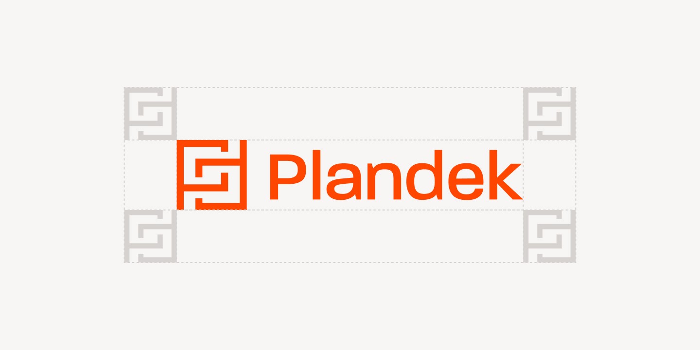
Safe area
Logo safe area
The safe area is defined by ¾ of the logomark’s size and should be applied on all sides of the logo. No text, imagery, graphic elements, or page edges should enter this protected area.
Logo strips
For optimal visibility when placing the Plandek logo alongside other logos, maintain sufficient spacing to ensure clarity and visual separation.
Use the width of the logomark as the minimum spacing for vertical gaps, and twice the width of the logomark for horizontal gaps. This helps the logo remain distinct, balanced, and easy to recognize in shared brand environments.
Hint: Always aim for visual balance when adjusting logo sizes. Do not simply make all logos the same height, as this often creates uneven visual weight and is considered incorrect practice.

Logomark safe area
The safe area is defined by ¼ of the logomark’s size and should be applied on all sides. No text, imagery, graphic elements, or page edges should enter this protected area.

Plandek colours
The brand’s colour palette embodies the essence of clarity, momentum, and data-driven confidence.
It reflects Plandek’s role in helping engineering teams understand complex delivery systems, surface meaningful insights, and make better decisions with greater speed and precision. The palette balances energy with reliability: bold enough to express action and progress, yet structured enough to support trust, focus, and analytical depth.
Together, the colours create a visual language that feels modern, purposeful, and intelligent — built for a product that brings visibility, direction, and measurable improvement to software delivery.
Mist
Blood Orange
Charcoal
Off-White
Misuse
Do not change the proportions of the logo design.
Do not use mixed-colour logo variants.
Do not customise the logo into a vertical composition.
Do not add shadow or glow effects to the logo.
Do not use the wordmark alone.
Do not use an image fill within the logo shape.
For logo backgrounds, do not use:
imagery that does not ensure proper contrast and accessibility
busy imagery
light imagery with a dark overlay
See how your engineering efforts translate into measurable business impact
Measure delivery performance, AI impact, and engineering productivity with hundreds of metrics, OOTB dashboards and custom configurations.












NEW
NEW
Contact us
UK Office
Unit 313 The Print Rooms, 164-180
Union St, London SE1 0LH
US Office
Floor 4, 1515 Mockingbird Ln,
Charlotte, NC 28209, USA