
How can DevOps metrics help managers make an impact and implement change?
Agile DevOps metrics are an increasingly hot topic. Up until recently, DevOps metrics (sometimes known as DevOps KPIs) have been constrained by the analytical capabilities of the underlying DevOps toolsets.
But with a new generation of Value Stream Management tools, it is possible to surface and synthesise data from multiple DevOps tools (e.g. workflow management tools, code repos, CI/CD tools and APM/ITSM tools).
As a result, a new wave of more powerful DevOps metrics and DevOps analytics are now helping DevOps practitioners deliver valuable software much more effectively.
Selecting the top 5 DevOps Metrics
We've selected the most popular DevOps metrics among our clients and have focused on those DevOps metrics that give you ‘the biggest bang for your buck', no matter your current level of Agile DevOps maturity.
The DevOps metrics selected are similar to the DORA metrics as popularised by the DevOps Research and Assessments (DORA) group. In this article, however, we've chosen our top 5 DevOps metrics selection based on actual feedback (and usage) from a wide variety of Plandek clients at all levels of Agile DevOps maturity.
As such, our picks for the top five DevOps metrics reflect what we actually see being used to drive value among our clients.
Deployment Frequency
Deployment Frequency is perhaps the most fundamental DevOps metric as it measures the ability of an organisation to develop and deploy to live small software increments rapidly. More specifically, it tracks the frequency with which increments of code are deployed to staging, testing and production.
As the core objective of Agile software delivery is ‘..the early and continuous delivery of valuable software..', Deployment Frequency is a core Agile metric and represents a core objective of effective DevOps. Deployment Frequency is also one of the four DORA metrics.
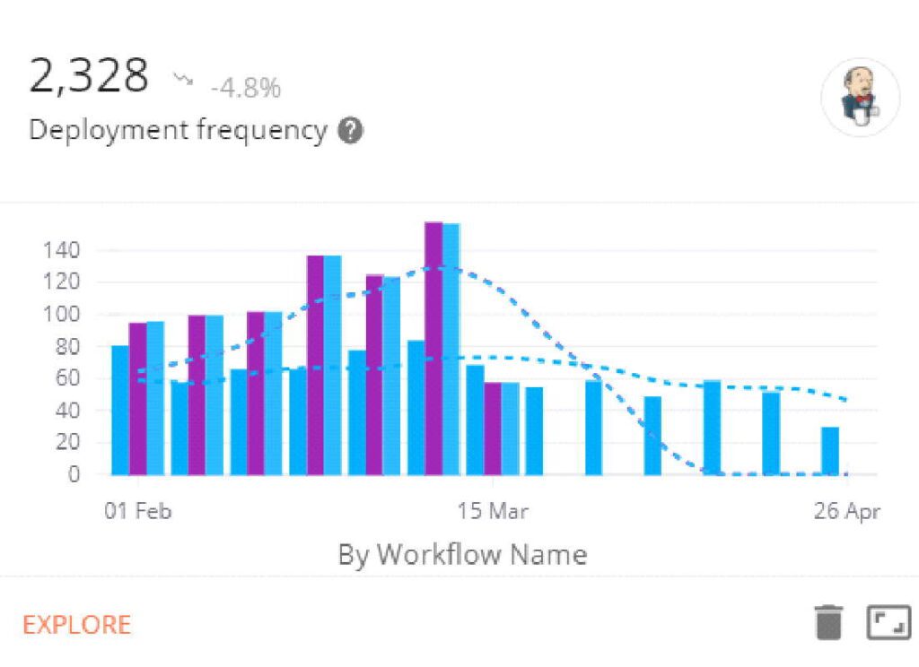
Example Deployment Frequency chart – Plandek DevOps metrics Dashboard
The calculation of Deployment Frequency requires surfacing data from CI/CD tools (e.g. Jenkins, CircleCI). This is typically done via reporting plug-ins to such tools or via an end-to-end delivery metrics dashboard like Plandek.
Delivery metrics dashboards like Plandek enable you to analyse delivery, engineering and DevOps metrics in a number of different ways. For example, you can analyse Deployment Frequency by branch, portfolio, programme, repository or team. As such, targets can be set, and practical actions are taken to increase Deployment Frequency, increasing your project turnover and, ultimately, your product's value.
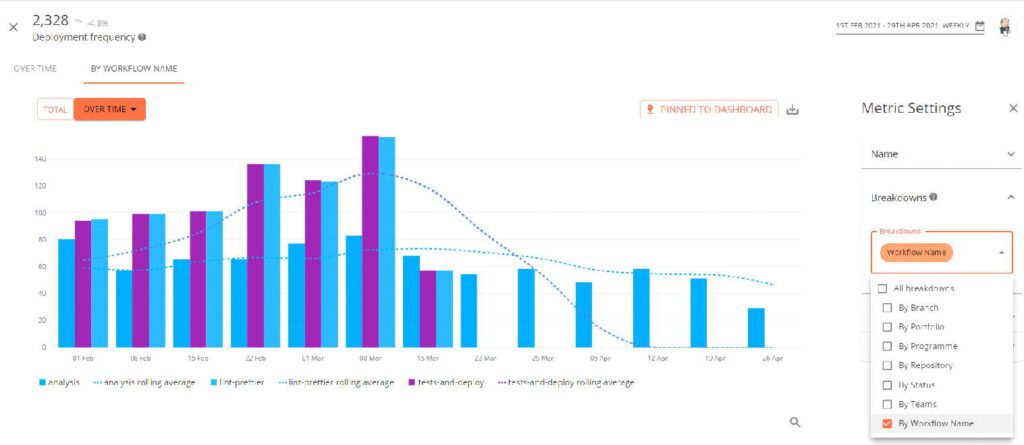
Example Deployment Frequency drill-down chart – Plandek DevOps metrics dashboard
Code Cycle Time
Code Cycle Time is a key DevOps metric as it tracks the efficiency of the Pull Request process – which itself is a critical element of the end-to-end software delivery process.
More specifically, Code Cycle Time analyses all completed Pull Requests (PRs) – such as closed, merged, and declined – within the specified time range and shows the average hours to complete.
Not only that, but Code Cycle Time provides full insight into the different stages that a PR goes through, such as Time to Review, Time to Approve, Time to Merge/Close and Time to Deploy.
The method of calculation of Code Cycle Time is shown below:

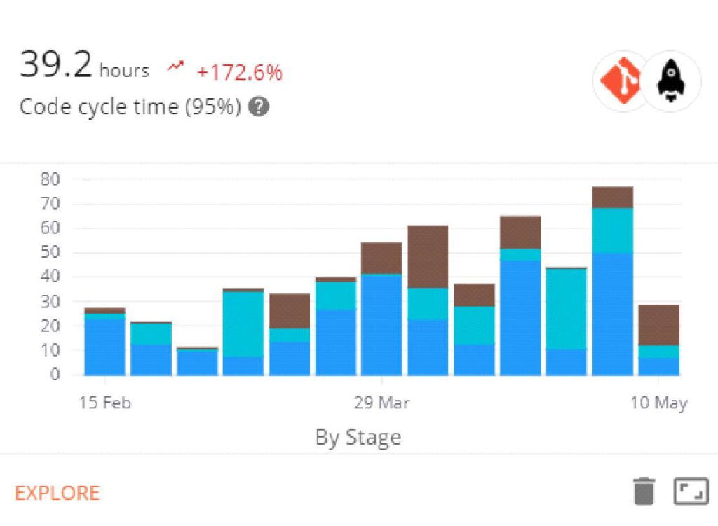
Example Code Cycle Time chart – Plandek DevOps metrics Dashboard
A powerful DevOps analytics tool like Plandek enables you to analyse Code Cycle Time using a number of different filters in order to identify bottlenecks and reduce them significantly. Such filters include analysis by PR author, PR participant, Code Cycle Time Stage, Repository and Ticket Issue Type.
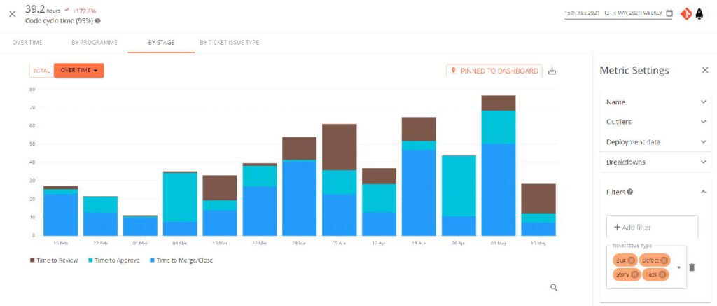
Example Code Cycle Time drill-down chart – Plandek DevOps metrics Dashboard
Mean Build Time
Mean Build Time is a very impactful DevOps metric for organisations at all levels of Agile DevOps maturity. It analyses the time taken for a build and is typically analysed by workflow.
It is a very good indicator of core DevOps process health as a steadily increasing mean workflow build time will drive longer Cycle Times.
We particularly like filtering by status to help you keep an eye on slow builds, which ultimately end in failure.
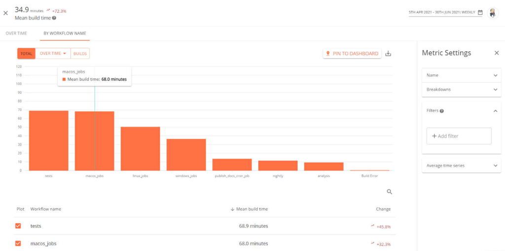
Example Mean Build Time view by Workflow Name
Mean Time to Recover from Build Failures
Mean Time to Recover from Build Failures is a key DevOps KPI as build failure is such a common occurrence and the main source of friction in the deployment process. As such, it needs to be tracked and managed.
The metric identifies how long it takes for the next successful workflow on a branch that has failed. Mature Agile DevOps organisations become very good at managing this recovery time and so improve their deployment frequency.
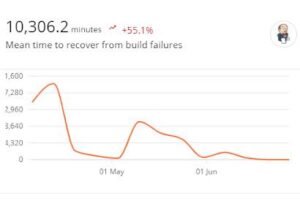
Example Mean Time to Recover from Build Failures metric view
Flakiest Files
Flakiest Files is a really helpful DevOps metric aimed at identifying fragile source code files in your codebase, which can be targeted for refactoring in order to reduce your Build Failure Rate.
The darker the shade of red, the more often a commit has resulted in a failed build. Plandek's drill-down enables you to filter by file extension to help focus on a particular subset of files.
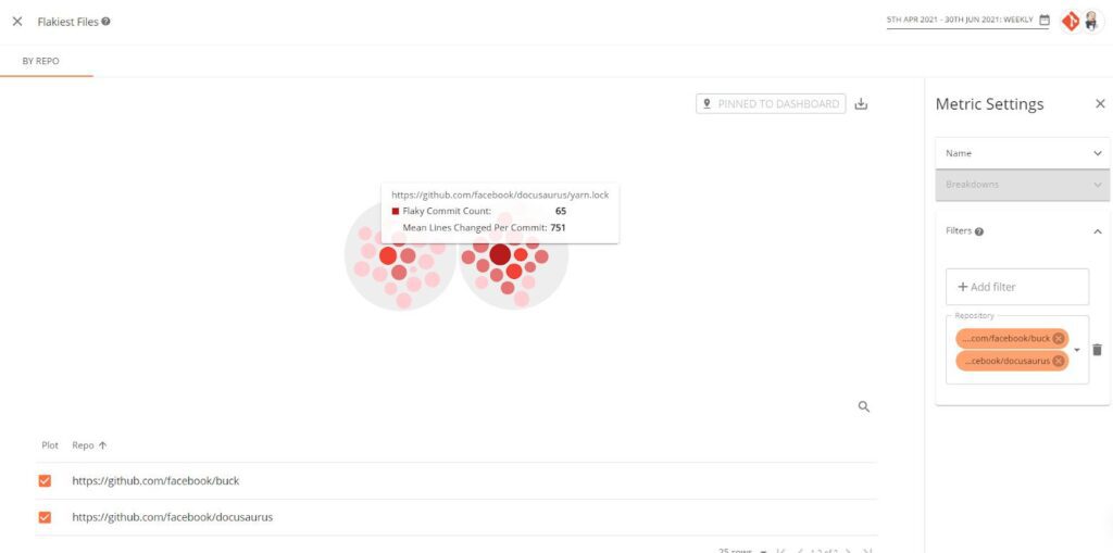
Example Flakiest Files DevOps metric view[/caption]
Build Failure Rate
Eagle-eyed readers will have noticed that this is the sixth metric in our Top 5 DevOps metrics guide, but we've included it as it's another key DevOps KPI that really shouldn't be left out.
Indeed, Build Failure Rate is an extremely helpful DevOps metric as it identifies the percentage of workflows which fail and the overall risk this poses to development.
As such, Build Failure Rate helps track and manage a significant source of risk both in day-to-day development and responding to incidents due to delays. Taking all your workflows over a period, it calculates the percentage that ended in failure.
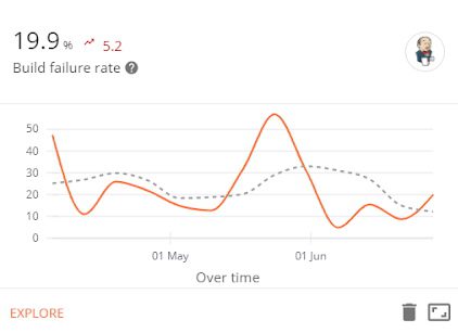
Example Build Failure Rate DevOps metric view
About Plandek
Plandek is an intelligent analytics and performance platform to help software delivery teams deliver valuable software faster and more predictably.
Plandek enables technology teams to track and drive their improvement and share understandable KPIs with stakeholders interested in accelerating value creation/ improving delivery efficiency.
Plandek works by mining data from delivery teams' toolsets (such as issue tracking, code repos and CI/CD tools) to provide actionable and intelligent insight across the end-to-end software delivery process.
Plandek is recognised as a top global vendor in the DevOps Value Stream Management space by Gartner and Forrester and is used by private and public organisations globally to optimise their technology delivery and accelerate R&D ROI.
For more information, please visit www.plandek.com.
Written by
Charlie Ponsonby
Co-founder & CEO
Charlie started his career as an economist working on trade policy in the developing world, before moving to Accenture in London. He joined the Operating Board of Selfridges, before moving to Open Interactive TV and then Sky where he was Marketing Director until leaving to found Simplifydigital in 2007. Simplifydigital was three times in the Sunday Times Tech Track 100 and grew to become the UK’s largest TV, broadband and home phone comparison service, powering clients including Dixons-Carphone, uSwitch and Comparethemarket. It was acquired by Dixons Carphone plc in April 2016. He co-founded Plandek with Dan Lee in 2018. Charlie was educated at Cambridge University. He lives in London and is married with three children.
See how your engineering efforts translate into measurable business impact
Measure delivery performance, AI impact, and engineering productivity with hundreds of metrics, OOTB dashboards and custom configurations.
Contact us
UK Office
Unit 313 The Print Rooms, 164-180
Union St, London SE1 0LH
US Office
Floor 4, 1515 Mockingbird Ln,
Charlotte, NC 28209, USA


