


I’ve been fortunate enough to be able to hear first-hand our client’s reaction to the latest version of Plandek which is just days away from being live. My favourite quote so far is from a user who currently uses Plandek, Jira & Confluence in combination for reporting:
“I have a Confluence dashboard that I can replace and improve upon in a few minutes with this new version of Plandek.”
The current incarnation of Plandek is still providing great insights to teams and organisations and allows automated and enterprise-level aggregation for our clients. However, for clients and users who want to take their insights to the next level, the new features shortly available in Plandek will be just what they need.
Organise your data however you want with Data Sets
Plandek allows clients to bring together Agile delivery and engineering metrics from several sources, including Work Item Tracking tools (like Jira or ADO), Code Repositories (like GitHub or GitLab) and CI/CD Pipelines (like Jenkins, TeamCity or CircleCI). These can now be organised in any way that suits each organisation we work with into discrete collections of data that we call Data Sets. These Data Sets can then, in turn, be organised into Super Sets reflecting any hierarchy or grouping required.
Slice and dice your metrics with Breakdowns
Seeing the trends in your data has never been easier with Breakdowns. Pick from several different fields in each metric and view the data broken down by those fields. Simples. In the example below, you can see a range of Jira fields available that can be used to view a variety of metrics. We can add any custom fields needed, and each breakdown can be viewed as a total (for a given time range) or in a time series across the same period.
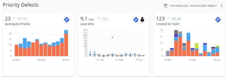
Make your metrics bespoke with Filters
By allowing our users to filter each metric by a variety of standard and custom fields, very specific metrics can be created. For example, a team might want to keep a sharp focus on their priority defects. By simply filtering by Issue Type and Priority, and selecting the appropriate values for the teams, a bespoke dashboard like the one below can be created. This is just one example, with filtering (and breakdowns) the different perspectives that can be created is almost endless.
In addition to the above, we also have some other great features to improve our users’ metrics experience:
Extract any view of data to .csv
Favourite any chart view on your dashboard
Search any list of data or factors
Select from a variety of chart types
In summary, it’s a hugely exciting time for the Plandek product, and getting relevant insights for your delivery and engineering teams is about to get a whole lot easier. I can’t wait to get more feedback from users as it begins to roll out and look forward to sharing more on this blog in the coming weeks.
Written by
Charlie Ponsonby
Co-founder & CEO
Charlie Ponsonby is CEO and Co-founder of Plandek, the leading Developer Productivity Insight (DPI) platform that helps software engineering teams drive productivity and transition to AI-led engineering. He writes widely on the opportunities and challenges inherent in the transition to the agentic SDLC. Prior to founding Plandek, Charlie founded Simplydigital, which grew to become the UK's largest broadband and digital services comparison business before being acquired by Europe's largest consumer electronics retailer. He started his career at Accenture and has held senior leadership roles in retail and telco. Charlie holds a degree from the University of Cambridge.


See how your engineering efforts translate into measurable business impact
Measure delivery performance, AI impact, and engineering productivity with hundreds of metrics, OOTB dashboards and custom configurations.


Contact us
UK Office
Unit 313 The Print Rooms, 164-180
Union St, London SE1 0LH
US Office
Floor 4, 1515 Mockingbird Ln,
Charlotte, NC 28209, USA